Problem
Gold Fish Casino rings the most engaging and thrilling casino and casual mobile social games to audiences worldwide. However, for the past couple of months, they have been experiencing decreased player retention and decreased player engagement.
Solution
Potentially incorporating a feature within the casino app that would celebrate Lunar New Year would not only introduce a new character, but would also target key performance indicators, such as player retention, increase player bets, increase in the amount of % spinning for a player, and increase SPSU (spins per spinning player).
User Personas
When creating this feature, I took a look at the player personas/ demographics. These were crucial to understanding why the player activity was down and how this quest can increase those two factors.
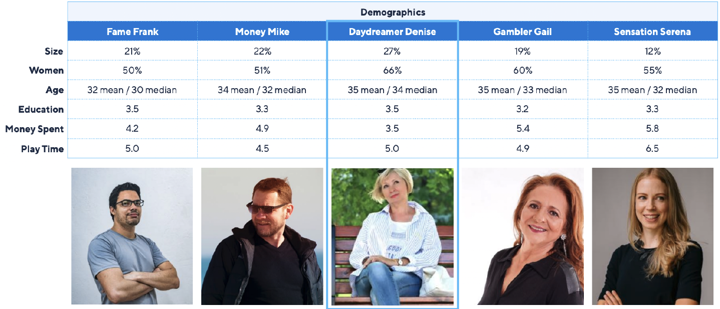
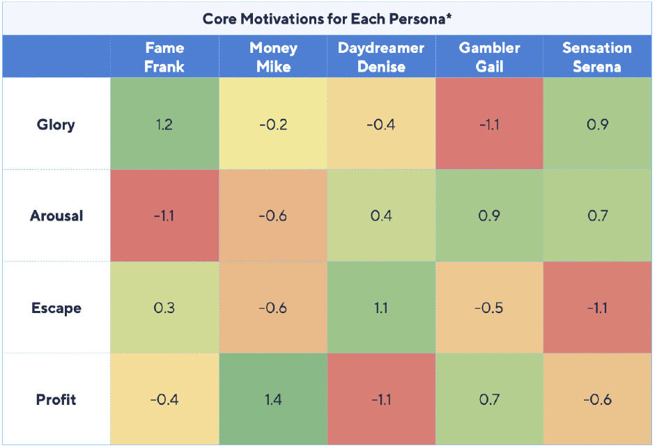
Additionally, taking a look at each player's core motivation will also aid in which specific demographic this quest will target. For example, with this feature, the main core motivation targeted will most likely be Profit. Profit core motivation gives the user a feeling of gaining money and wanting to get rich and win prizes. With that being said, Mike Money will get a high takeaway than say Sensation Serena who has a core motivation of Glory. Glory core motivation gives the player a feeling of importance and glamor. The player enjoys challenges and wants others to envy their gaming abilities and success.
User Flow
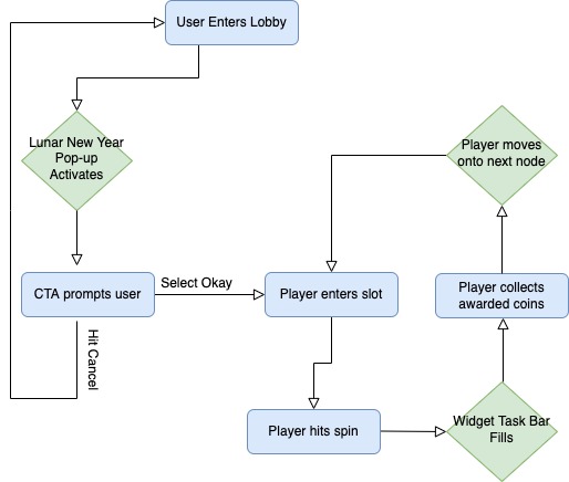
Next, I mapped out a simple player flow that showcased the first-time player experience. Meaning, that right when the player opens the app and enters the lobby a popup for the Lunar New Year Quest will activate prompting the user to enter a slot and spin, to complete a task and complete a node, etc. A blue rectangle will indicate the task and the green diamond will indicate the action. A blue rectangle will indicate the task and the green diamond will indicate the action.
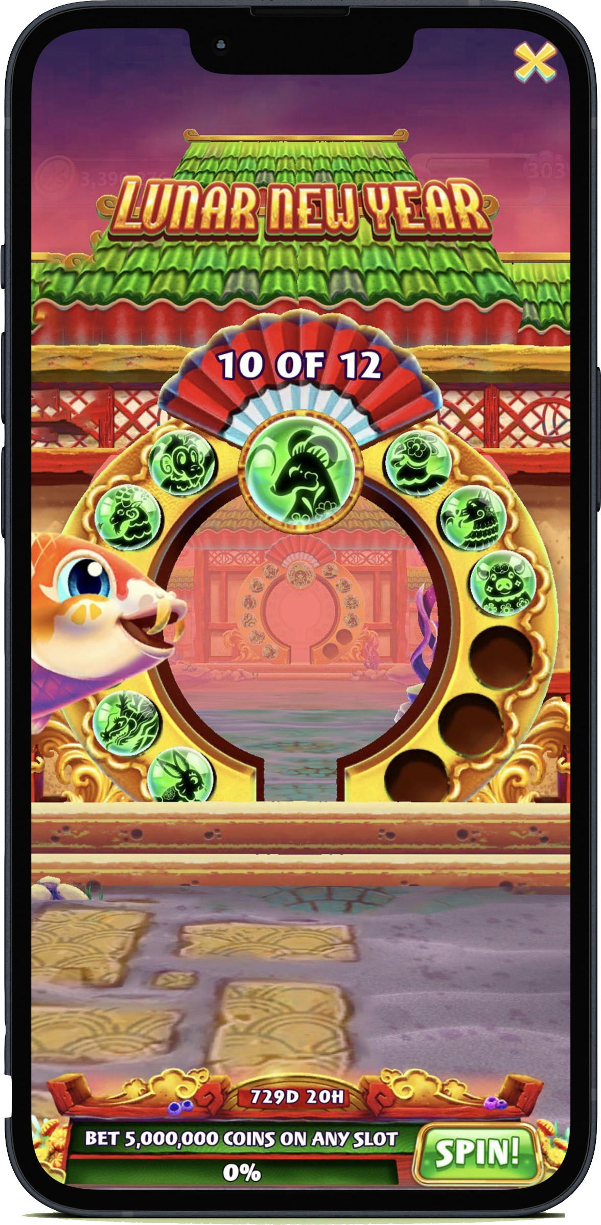
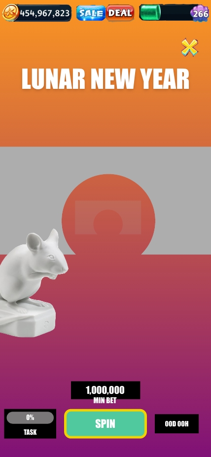
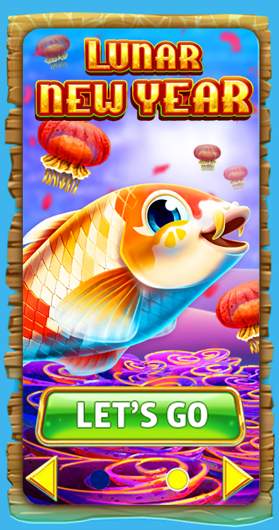
After analyzing demographics, core motivators, and mapping out a user flow it was time to create a low fidelity mockup of the quest. When creating a low fidelity mockup, I always like to start at the lobby and provide a billboard and popup for any feature or quest. These will be the first two items that the player will see, so it is important to display something here.
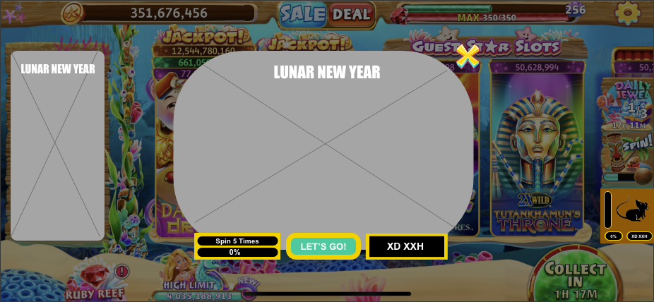
Next, I created a step-by-step wireframe of what happens once the player enters a slot. Once the player selects the "spin" CTA button, the progress meter on the widget will fill and take the user to another screen where the player will collect their winnings. Then, proceed to show a first-person point of view going through the gate to greet the next Zodiac character.
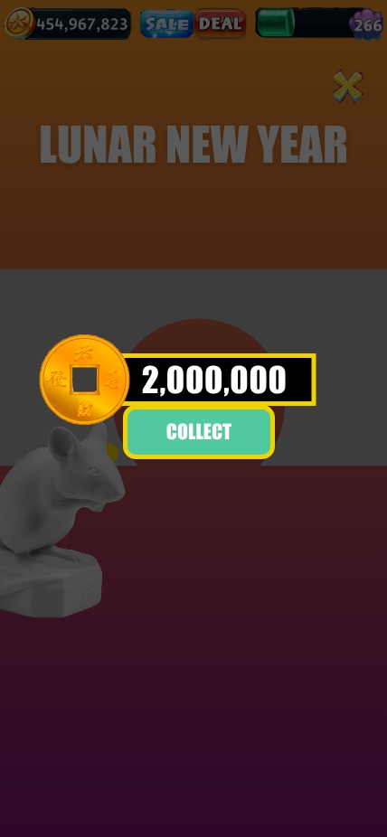
This was an iterative process for me, as this was the first time that I was introduced to transitioning and auto animate in Adobe XD. After presenting these mockups a few times with the Live-Ops team and the Lead Art Director I ended up fixing a lot of issues based on the feedback that was provided to me. Some issues involved the transition and auto animations not flowing correctly, needing to provide some sort of celebration to let the player know they won coins and differentiating the difference in transitions between the first node and the final node.
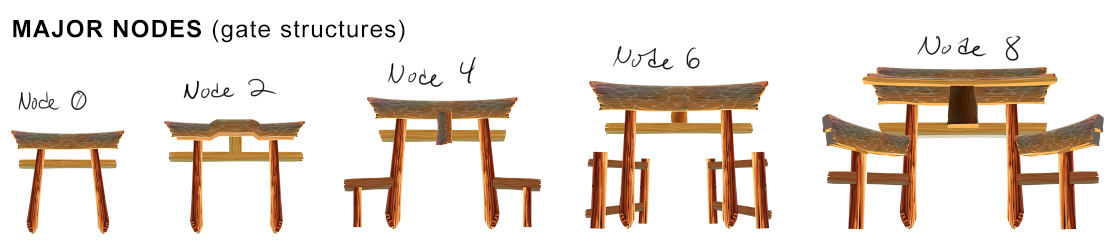
Pivoting away from primary research. It was time to collaborate with the art team to come up with a concept for Lunar New Year. Within this quest, multiple themes, and concepts needed to be covered in this quest. First, was brainstorming the progression of the torii gate as the player greeted each Zodiac animal.
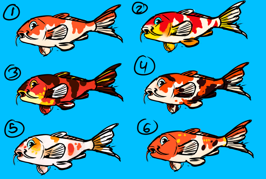
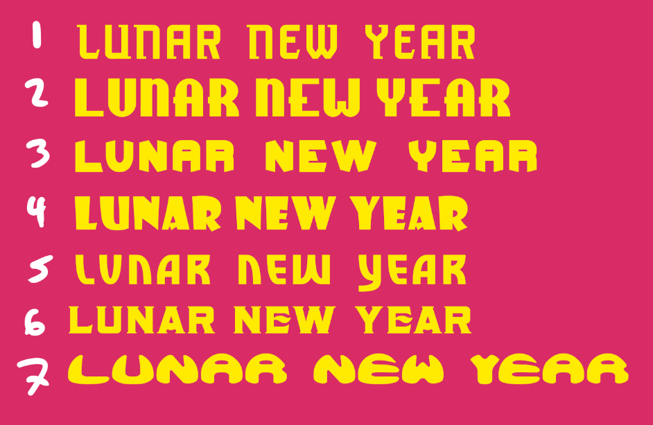
Then, once the torii gate was mocked up out, it was time to concept out the new koi fish character and font set that will be utilized for this quest. Multiple color variations were designed with this character, but after a round of usability testing within different team departments, koi fish number five and font style number two were the best fit.
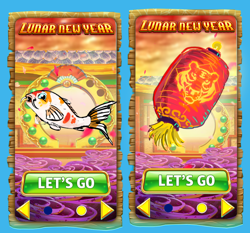
A few other items were also decided on during this phase of the quest design. The billboard in the main lobby will let the player know what new and exciting features we have to offer. Two ideas were mocked up when designing the billboard. The first idea had the new koi fish character, and the second idea had a lantern with a tiger on it (the year of the tiger). Since there will be a new character introduced within this quest, it made the most sense to proceed with the first billboard idea.
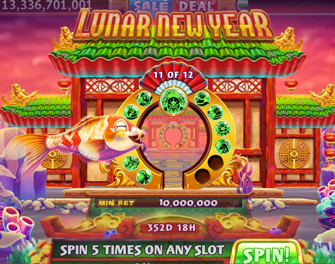
Lastly, designing the widget. This was also an iterative process, as the widget should be able to measure the percentage of each task completed, but also let the player know which Zodiac member they are encountering.
Finally, after analyzing demographics and core motivation, mapping out the user flow, building the quest based on the GFC brand, and creating & iterating low fidelity mockups it was time to start building a high fidelity mockup. With my initial high fidelity mockups, I followed a similar flow to my low fidelity mockups. However, the main focus was more on the first-person point of view as the character moves through each gate. There was also a few aspects within this scene that were also of importance. For example, will the player encounter a statue at each gate (or node)? How will the player know which gate they are in?
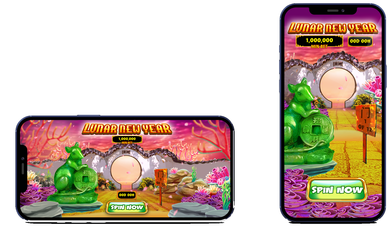
After conducting a round of playtests within the different departments, some changes were made. First, a decision was made to remove the statues shown in the first mockup. The Zodiac statue proved to take up a good amount of space. This looked okay in landscape view on an iPhone, however when it came to portrait amount of space was limited. So the statue was removed and the koi fish character would take its place. Another change that removing the sign that stated what gate, or node the player was in regards to progression. The sign also posed the issue of taking up too much space. The solution to this was incorporating the progression into the gate.
 View Demo
Conclusion
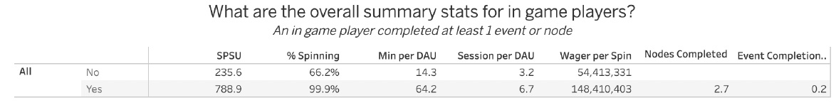
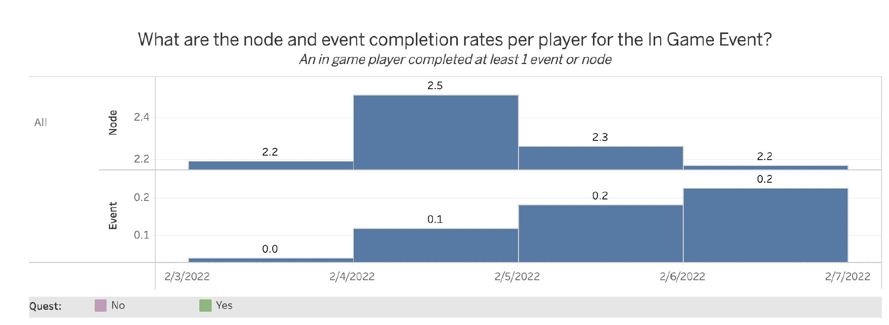
Once the final iterations were in place and the quest was polished it was time to release it to the public. After this quest was released to the public for gameplay, we were able to collect some data to see if this quest feature did in fact help improve retention and engagement. From the results that were gathered, it did look like we had an increase in % spinning, SPSU (Spins per spinning user), and an increased wage per spin (meaning the player increased their bet as they spun). However, some results showed the average player only completed about three gates (nodes) within the quest. The reason possibly is that this quest had 12 nodes for the player to beat. Providing a quest with this many nodes might have been very redundant for the player, the player could have been bored after the third node, or they ran out of coins.
Learning from these results can provide a better inside for future quest features. Maybe building a quest with not as many features would be a great takeaway. Additionally, each node could provide something exciting for the player so they have that anticipation and excitement to see what is next. With that being said, I would like to thank you for taking the time to read my case study!