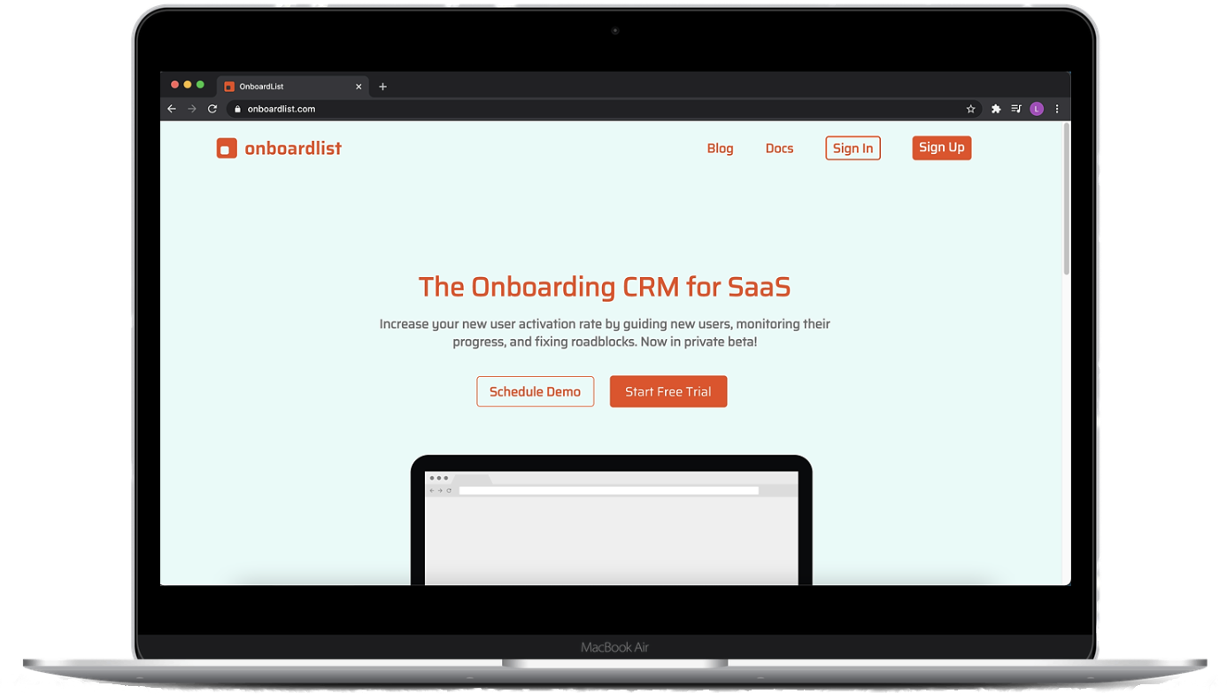
Onboardlist
Roles
- UX/UI Design
- Branding
- Visual Design
Problem
Imagine your first time using new software. You create an account and you're finally ready to test it out. However, you have to click multiple times to get the software's product tour to get to the reason why you wanted to use the product in the first place. In most cases, users end up giving up or skipping the product tour entirely, which can be tiresome and lead to even more confusion on how to use the product.
Solution
Onboardlist is a SaaS tool to help businesses convert more users with easy-to-follow personalized checklists and reminder emails to give to users widgets to show them what is needed and how to use the features.
For early implementing, I referred to other SaaS websites, like Slack, Spotify and Dropbox. From there I was able to come up with an inital redesign mockup for Onboardlist. I incorporated some elements from the original website such as navigation at the header of the website, as well as elements from the other Saas websites.


You can view the mockups below for more details
View Web MockupIn addition to creating an initial redesign mockup, I also designed three style guides and logo variations to get an idea of how the logo and brand would look with different fonts and color schemes. I incorporated cool and warm tones into the style guides to get a better idea of how the overall look of the landing page could be.
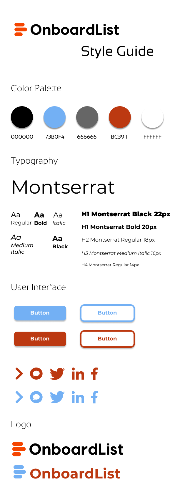
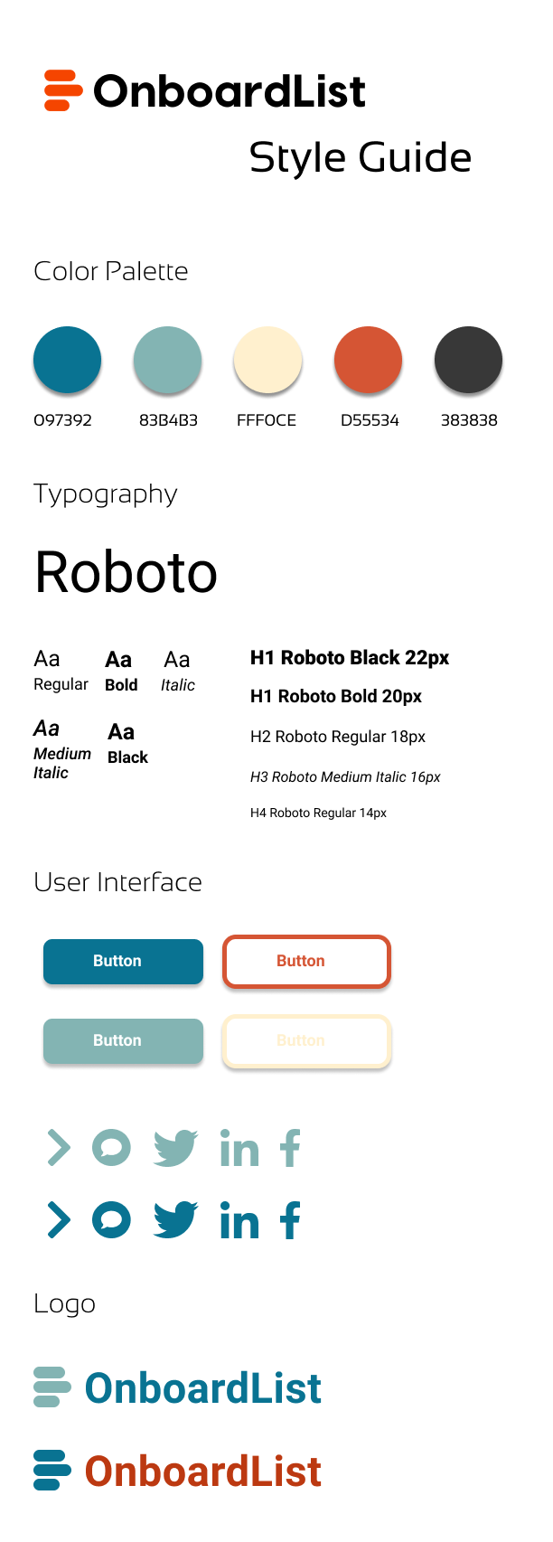
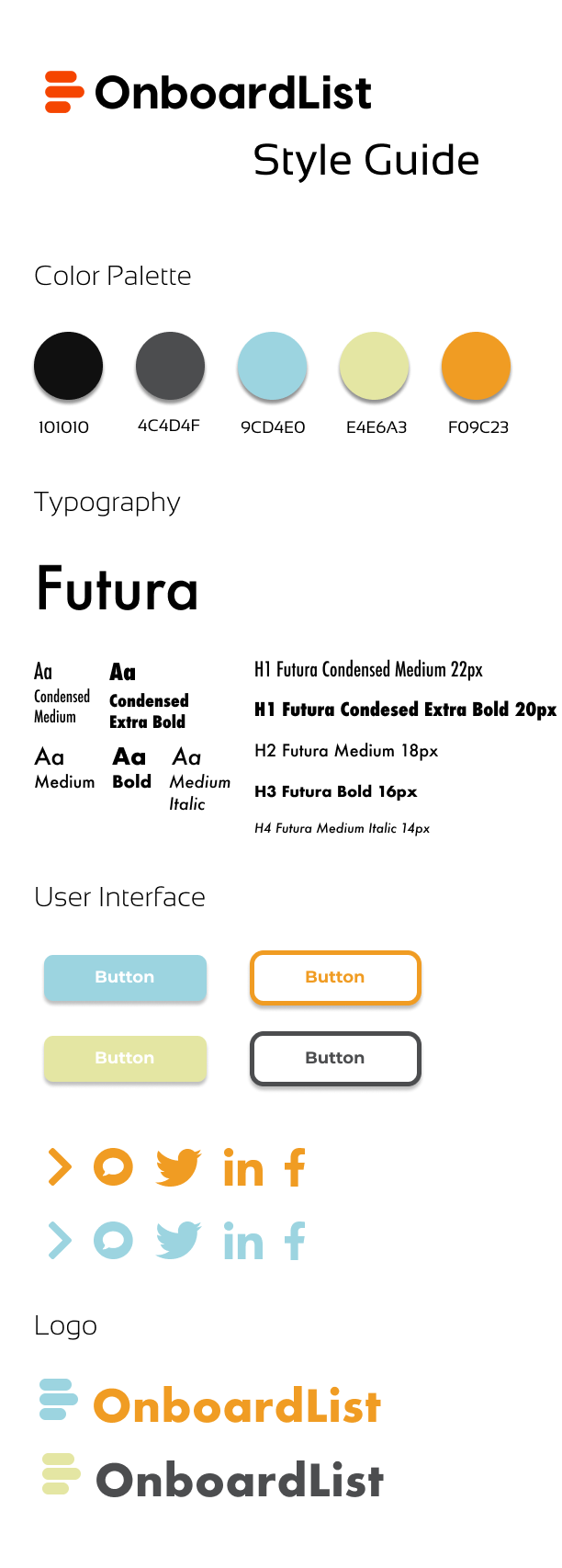
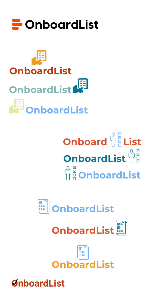
After presenting the initial landing page, style guides, and logo variations I received feedback. For the landing page, the scale of the heading seemed off, and navigation elements need to be visually grouped. Additionally for the next iteration maybe consider designing it in greyscale first and then add color. Next, is the feedback regarding my style guides. The first two color palettes looked great, however, the third style guide would not be a good fit for a tech startup as the colors are too light and vivid. Lastly, feedback regarding my logo variations. The logos that were used need to be legible over both a light and dark background, since browsers can be used in either light or dark mode. Additionally, using different colors for icons and text doesn't seem to work well.
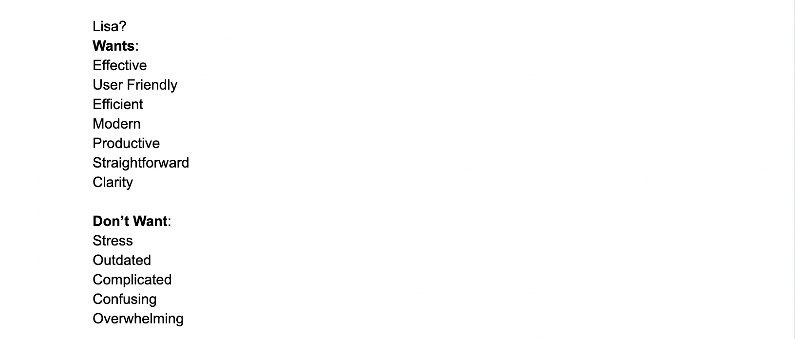
Before diving into the second design iteration, I needed to figure out what exactly Onboardlist's brand is. To do this, I did a five-word pairing exercise to determine brand words. I started by listing what I wanted, followed by what I don't that is somewhat related to what I want but maybe a negative for the brand. Next, I came up with the word that represents the brand using this equation.
Want - Don't Want = Brand Word.
These are the words I came up with to determine the brand.
For my second web landing page mockup, I started designing the website in greyscale to layout elements, like the CTA buttons and navigation elements. I used a website called BetterApp as a reference for placement of everything on my landing page mockup.

Then for my style guide I designed, I went for a cool color scheme. I stayed with the original logo because it's simple enough to use as a favicon in browsers. Additionally it can be used as a social media profile pic for Facebook or Twitter.
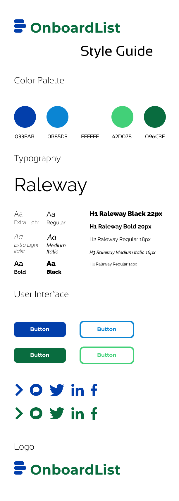
View Style Guide
Conclusion
In conclusion, I had a wonderful experience interning for Onboardlist. I learned a lot about SaaS product tours and why they do not work. For example, 80% of new users will quit on a product tour if has more than five steps. Additionally, I learned some great design tips while designing this website. Tips such as, when designing a mockup start designing in greyscale first and then add in color. This way you don't spend too much time with the color scheme and designing. It was a great experience to utilize my UX/UI skills and implement them into this project.
Thank you for taking the time to read my case study!
